How it all started
Back in 2018 I needed to update my portfolio site (as designers are wont to do). I thought I'd steer away from current trends and build a site that tapped into the 80s and 90s Cyberpunk aesthetic. The genre contains some of my favorite movies like Ghost in the Shell (1995), The Matrix (1999), and Akira (1988). That's where I borrowed few visual motifs like the bold katakana lettering on the homepage and the text decoding effect as a homage to the Matrix's "Digital rain" effect, which was itself inspired by Ghost in the Shell's opening credits. There's even a nod to Ghost in the Shell on my 404 page.

The first iteration
I was learning React when I first built this website, and while overkill for a personal portfolio site, it was a great opportunity to learn and experiment with learning it. I've found the best way to learn is by actually making something that you intend to use and ship.
The no-brainer choice at the time was Create React App. It served me well in getting things up and running without having to fuss about with config. On top of that, I was using Styled Components, Tween.js, and React Transition Group. I was also playing with some early Three.js effects like the displacement sphere that still resides on the homepage.
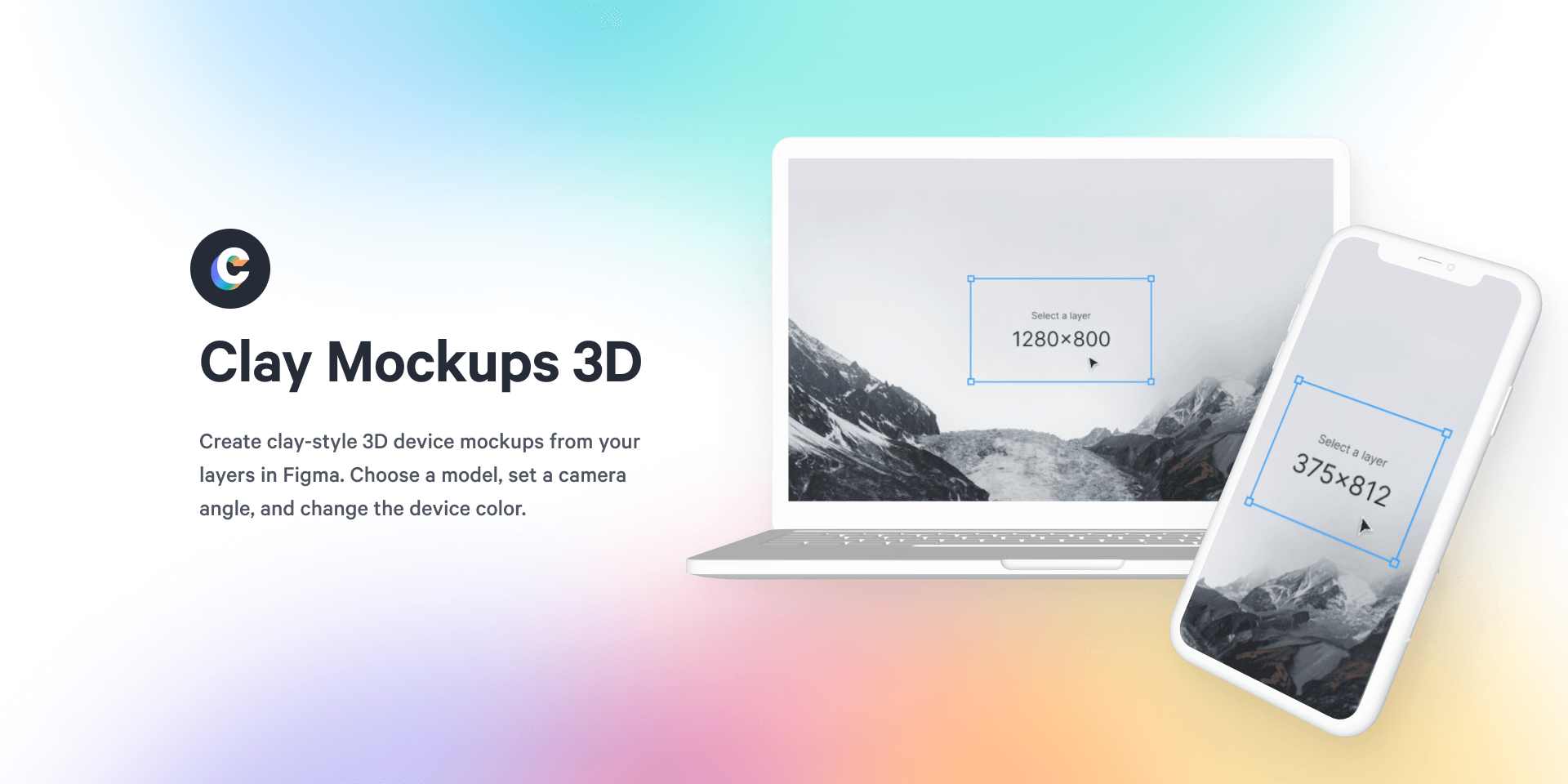
Since then I've used this website as a playground for experimenting with new tech and techniques, so over time I've overhauled pretty much everything. A big change along the way was replacing images of my work in static mockups with real-time rendered interactive 3D devices using models I created for the Clay Mockups 3D Figma plugin.

Migrating to Next.js
With Create React App I was using a somewhat janky and unmaintained package to prerender the site as static HTML in Puppeteer. This worked okay for the most part, but I wanted a more robust solution for posting articles (like this one you're reading) using MDX. I had a half baked version of this lying dormant in the repo, but it never felt good enough to publish. I looked at a few options like Gatsby, Vite, and Parcel, and Remix, but Next.js stood out as the most suited to my needs.
- The site is now based on Next.js. Is a much better fit than Create React App. For now I'm just using it to create a static export, but maybe I'll add some server rendered stuff in the future.
- Styling is now vanilla CSS with postcss to add support for the future native CSS nesting and custom media queries features. I'm using CSS modules instead of BEM syntax to avoid style conflicts.
- For generating pages from
.mdxfiles, I'm using Kent C Dodds' mdx-bundler. In combination with Next.js it makes generating pages from.mdxfiles really quick and simple. - For animation I've moved from Tween.js and React Transition Group to just Framer Motion.
- 3D effects are still all using Three.js, but I've added
three-stdlibas a better maintained replacement for modules from Three's examples.
Not all smooth sailing
For the most part, the migration was pretty straight-forward. The way I has structured the site with React Router lent itself well to conforming with Next.js's file-based routing, and I was already using postcss for styling. I did, however, encounter a couple of problems:
1. Route transitions
There was a bit of a conflict when it came to animated route transitions. Next.js will immediately yank out all of the styles for the previous page when navigating to a new one. This works great when you're not animating between pages because it cleans up any unused styles form hanging around. When you are animating the page transition though, all of a sudden the previous page becomes jarringly completely unstyled as it transitions out. This problem one of the most commented and reacted to issues on the Next.js repo, so hopefully there's a fix soon, but for now I've dropped in a hack to fix things from the issue's comments.
2. Scroll restoration
Somewhat related to the route transitions, I had to opt out of both Next.js's and the native browser's scroll restoration in order to prevent the browser immediately scrolling to the top when the page started transitioning out. Next.js also doesn't appear to handle shifting focus when linking to the id of an element within the page, so I added that in for accessibility.
Looking back, and forward
It's been pretty neat to see how popular the site's been on Github, with 500 stars (as of writing this post). It's also neat seeing how people adapt it to their own style and modify it, which is part of the reason I made it open source. I want others to be able to take it apart and see how it's made, learn from and improve upon it. That's what inspect element used to be like on the web, but with modern sites compiling and minifying and injecting garbled strings into css classes that's not as simple these days. The next best thing I could do was to open source it.
I look forward to continuing to use this site as a playground, and it'll be interesting to compare the next iteration to where it is today.
